Elevating Lululemon Email Marketing
A Complete Redesign of the System and Templates.
Problem Statement
The existing email marketing design system was outdated and lacks the flexibility, consistency, and user engagement necessary to meet the evolving needs of our marketing strategies. It fails to provide a seamless experience across different devices and platforms, resulting in inconsistent branding, lower engagement rates, and inefficient design workflows.
display poorly on different devices, particularly mobile, leading to lower engagement and higher unsubscribe rates.
1. Responsiveness
The design templates were rigid and did not easily accommodate different types of content or varying campaign goals, making it difficult to adapt to new marketing strategies
2. Limited Flexibility
Emails displayed poorly on mobile devices, with issues like distorted layouts, unreadable text, and slow loading times, resulting in lower engagement and higher unsubscribe rates.
3. Mobile Optimization
the solution
Built mobile-first guidelines, templates, and tools in Figma to create an email system that’s scalable and easy for all lululemon designers to use across the globe.
Grid Anatomy
Design utilizes a base-8px layout grid with a fixed width with 24px margins and 8px gutters across all clients whereas mobile is responsive and will scale proportionately to suit a variety of screen sizes.
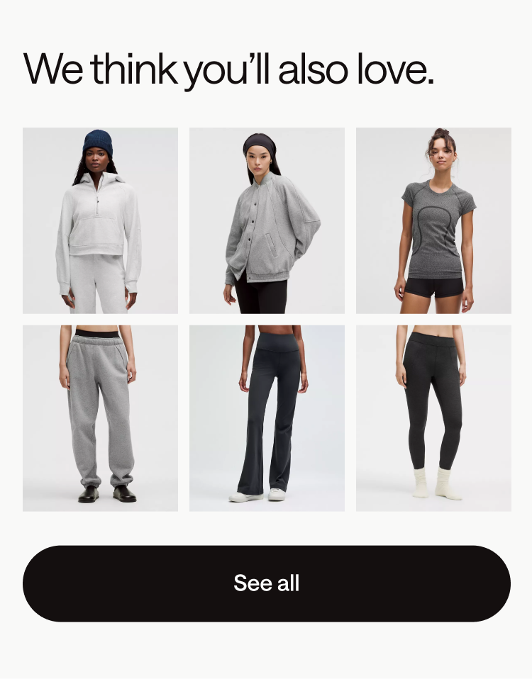
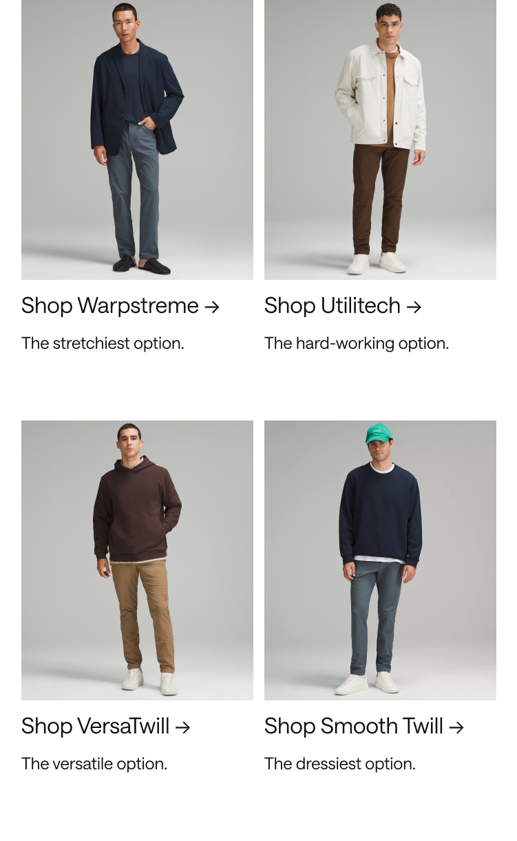
The resolution of modern phones means we can provide the users with higher fidelity layouts, preserving the visual hierarchy—without compromising usability. This means using 2 and 3 columns product grids on mobile to match the desktop layouts.
email
components
using modular components, like a side of lego pieces. These modules allow designers to assemble and customize emails easily, ensuring flexibility, consistency, and efficiency while creating engaging and on-brand communications.
Text Modules
Grids
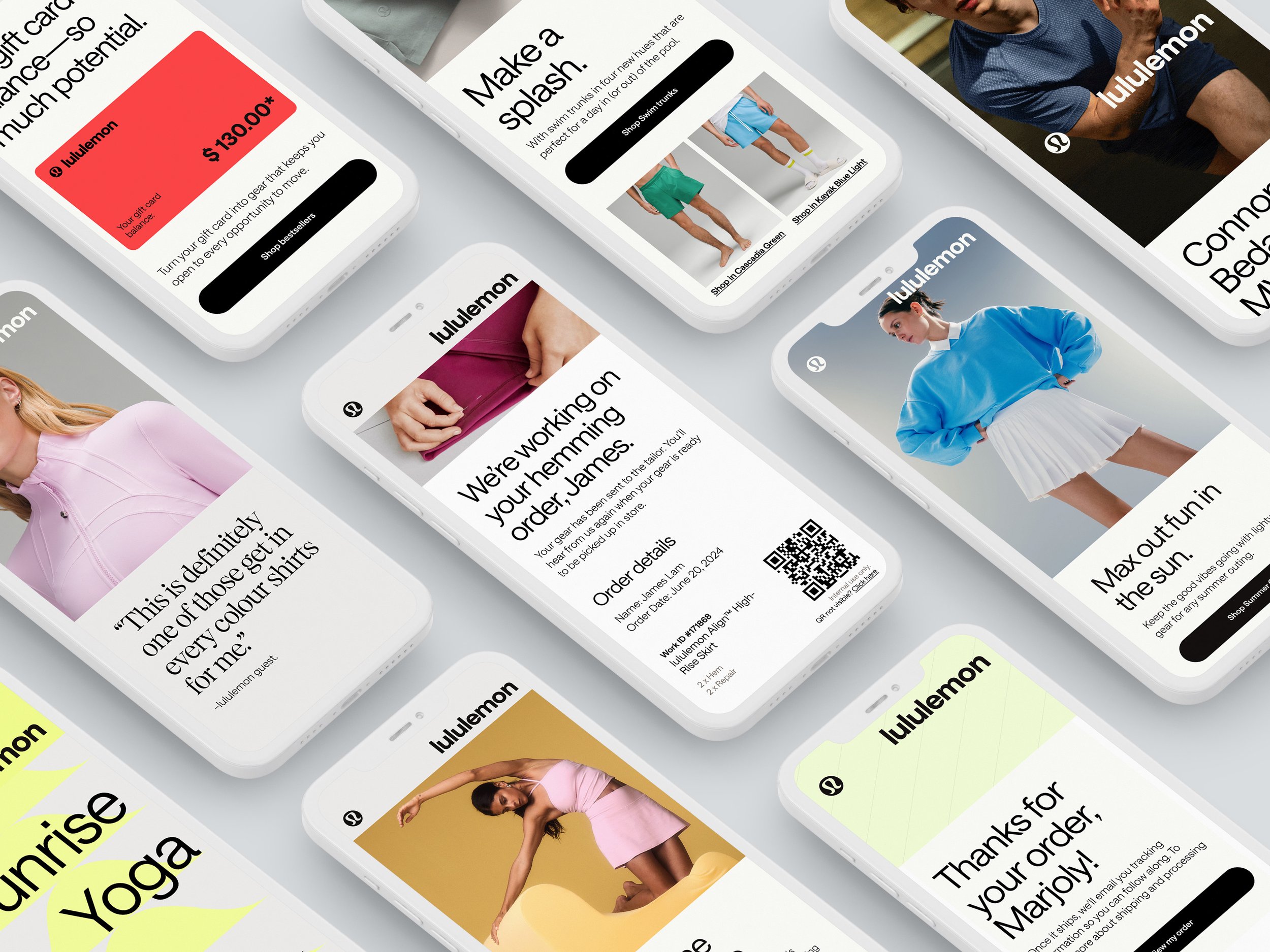
Emails That Speak, Inspire, and Convert.
Few examples of emails that effectively utilize my design systems to create a cohesive and engaging experience. Each example showcases how design principles can enhance readability, highlight key information, and maintain brand consistency


